 Skip to main content
Settings
Menu Manager addon WHMCS
Order now | Download | FAQ
Overview
The Settings page allows you to select the active navbar style for the WHMCS client area.
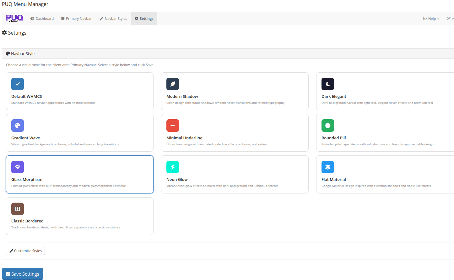 Settings — select the active navbar style from 10 available options
Navbar Style
The main section of the Settings page displays all available navbar styles as selectable cards. Each card shows:
- Style icon — a colored icon representing the style
- Style name — the name of the style
- Description — a brief description of the visual effect
Click on a style card to select it. The currently active style is highlighted with a border.
Available Styles
| Style | Description |
|---|---|
| Default WHMCS | Standard WHMCS navbar appearance with no modifications |
| Modern Shadow | Clean design with subtle shadows, smooth hover transitions and refined typography |
| Dark Elegant | Dark background navbar with light text, elegant hover effects and premium feel |
| Gradient Wave | Vibrant gradient backgrounds on hover, colorful and eye-catching transitions |
| Minimal Underline | Ultra-clean design with animated underline effects on hover, no borders |
| Rounded Pill | Rounded pill-shaped items with soft shadows and friendly, approachable design |
| Glass Morphism | Frosted glass effect with blur, transparency and modern glassmorphism aesthetic |
| Neon Glow | Vibrant neon glow effects on hover with dark background and luminous accents |
| Flat Material | Google Material Design inspired with elevation shadows and ripple-like effects |
| Classic Bordered | Traditional bordered design with clean lines, separators and classic aesthetics |
Saving
After selecting a style, click the Save Settings button at the bottom of the page. The selected style is immediately applied to the WHMCS client area.
Customize Styles
Click the Customize Styles link below the style cards to navigate to the Navbar Styles page, where you can edit colors, shadows, and other properties for each style.