 Skip to main content
Navbar Styles
Menu Manager addon WHMCS
Order now | Download | FAQ
Overview
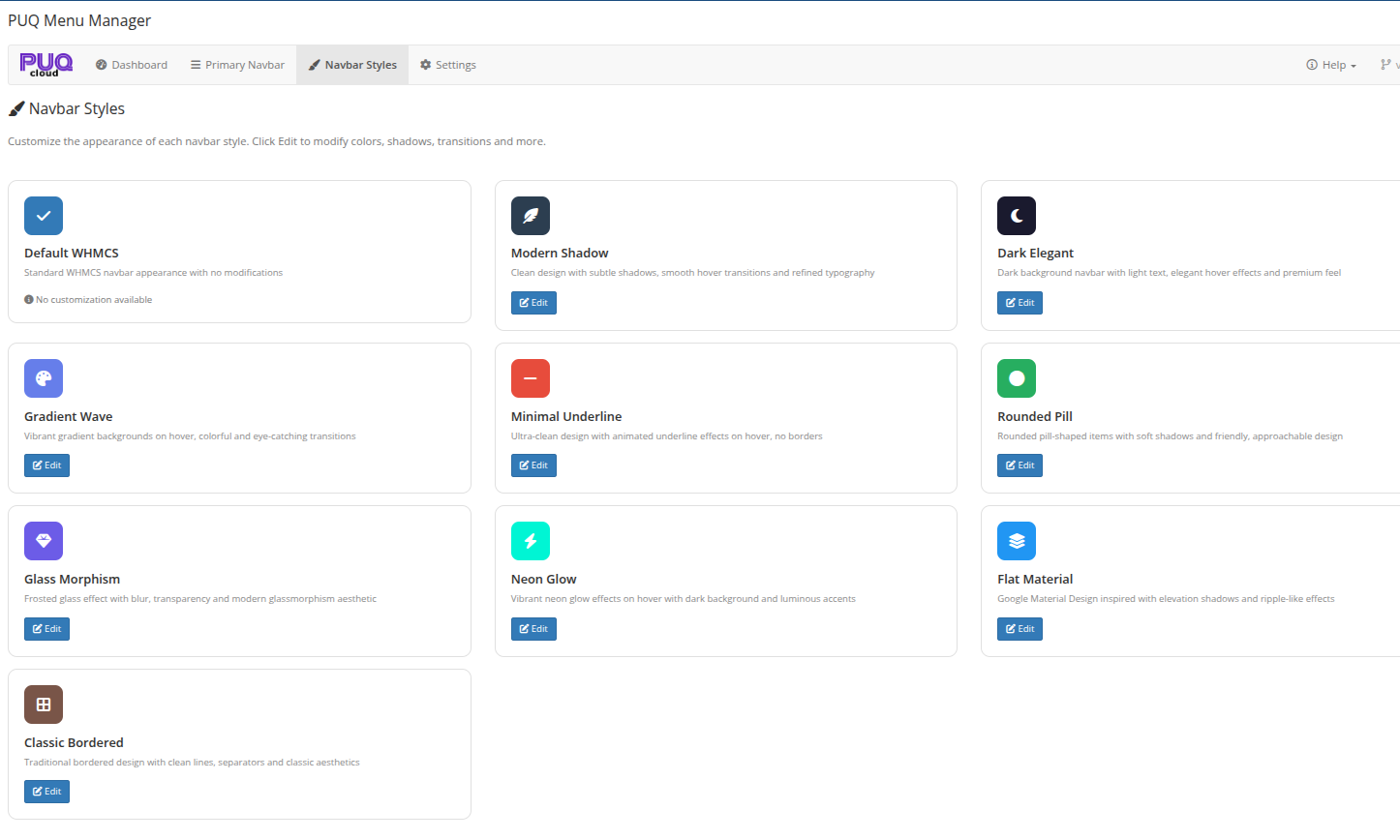 Navbar Styles — all 10 available styles with descriptions and Edit buttons
Available Styles
| Style | Description |
|---|---|
| Default WHMCS | Standard WHMCS navbar appearance with no modifications. No customization available. |
| Modern Shadow | Clean design with subtle shadows, smooth hover transitions and refined typography |
| Dark Elegant | Dark background navbar with light text, elegant hover effects and premium feel |
| Gradient Wave | Vibrant gradient backgrounds on hover, colorful and eye-catching transitions |
| Minimal Underline | Ultra-clean design with animated underline effects on hover, no borders |
| Rounded Pill | Rounded pill-shaped items with soft shadows and friendly, approachable design |
| Glass Morphism | Frosted glass effect with blur, transparency and modern glassmorphism aesthetic |
| Neon Glow | Vibrant neon glow effects on hover with dark background and luminous accents |
| Flat Material | Google Material Design inspired with elevation shadows and ripple-like effects |
| Classic Bordered | Traditional bordered design with clean lines, separators and classic aesthetics |
Editing a Style
Click the Edit button on any style card to open the style editor page.
Note: The Default WHMCS style has no customization options — it uses the standard WHMCS navbar without any CSS modifications.
Style Editor
The style editor provides a live preview and property controls for customizing the selected style.
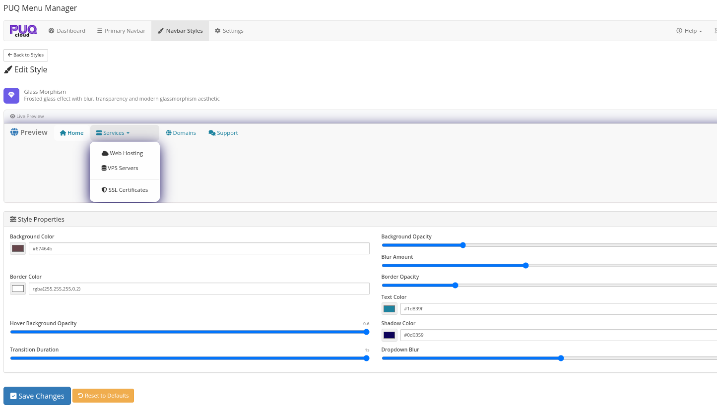 Style Editor — Glass Morphism style with live preview showing dropdown menu and customizable properties
Live Preview
The top section shows a live preview of the navbar with the current style settings applied. The preview includes sample menu items (Home, Services, Domains, Support) with a dropdown example, so you can see how the style looks in real-time as you adjust the properties.
Style Properties
Each style has its own set of customizable properties. Common properties include:
| Property | Description |
|---|---|
| Background Color | The background color of navbar items |
| Background Opacity | Opacity of the background color |
| Border Color | Color of the item borders |
| Border Opacity | Opacity of the borders |
| Text Color | Color of the menu item text |
| Shadow Color | Color of box shadows |
| Hover Background Opacity | Opacity of the background on hover |
| Blur Amount | Blur intensity for glass effects |
| Dropdown Blur | Blur intensity for dropdown menus |
| Transition Duration | Animation speed for hover effects (in seconds) |
Properties vary between styles. For example, Glass Morphism includes blur controls, while Gradient Wave includes gradient angle and colors.
Action Buttons
| Button | Description |
|---|---|
| Save Changes | Saves the current style properties to the database |
| Reset to Defaults | Restores the default values for all properties of this style |
Client Area Examples
Below are examples of how different navbar styles appear in the WHMCS client area.
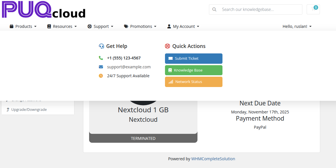
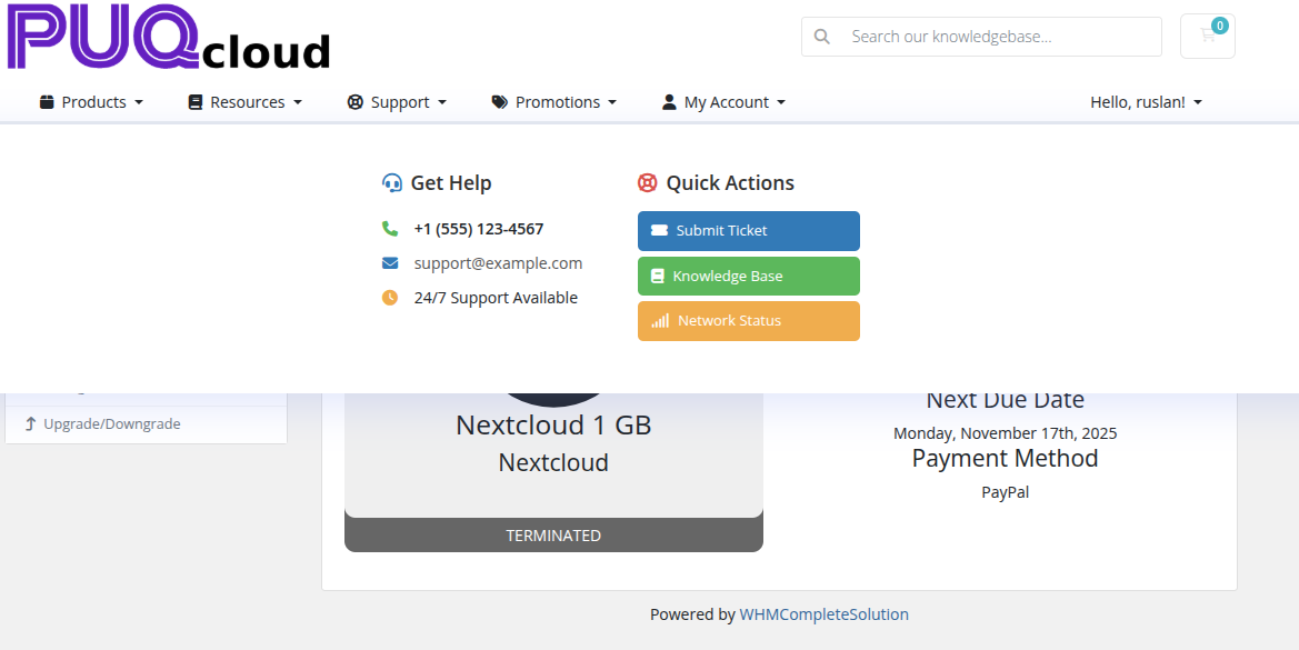
Glass Morphism
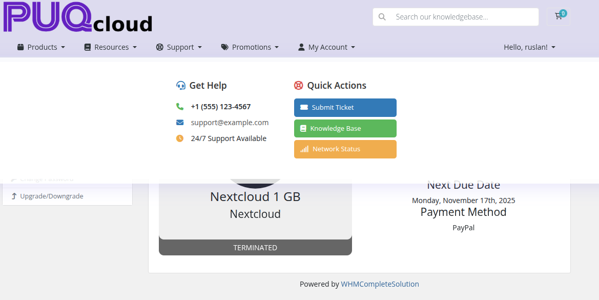 Glass Morphism — frosted glass effect with mega menu showing Get Help and Quick Actions
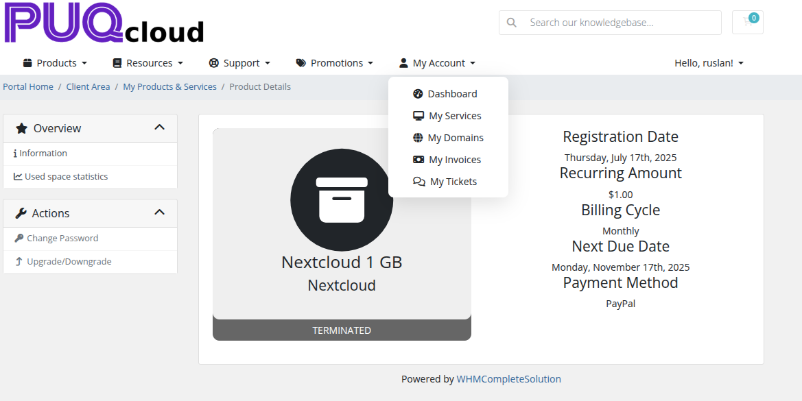
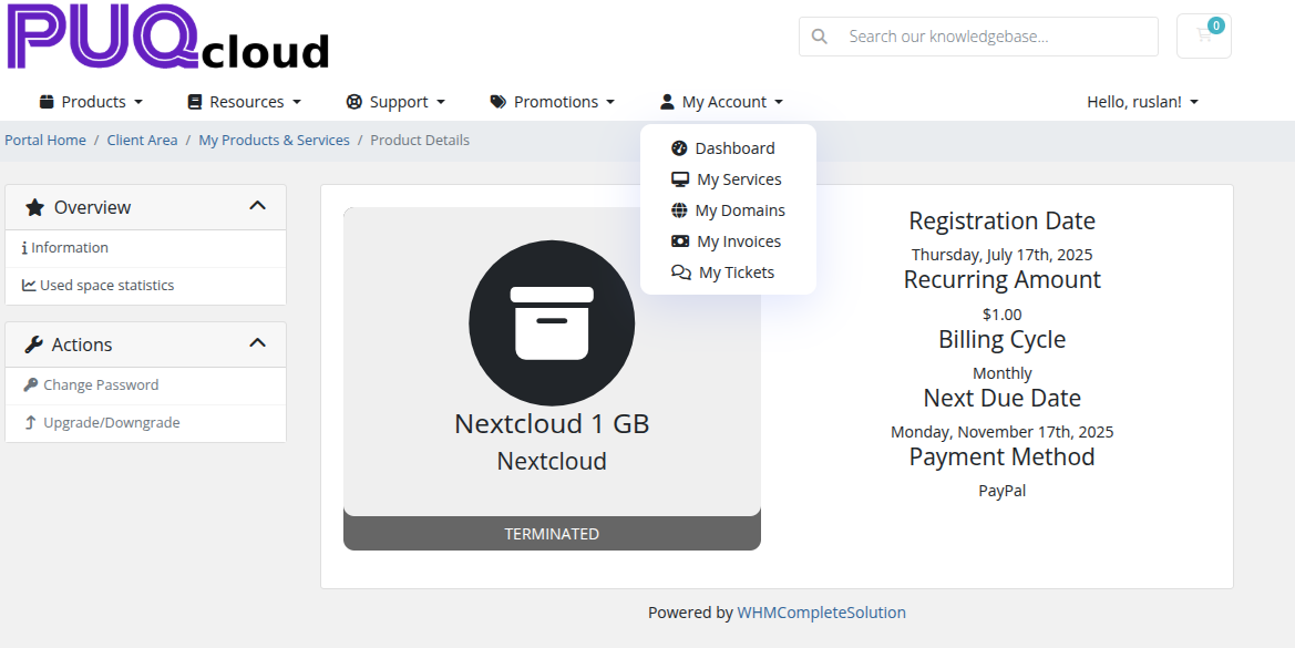
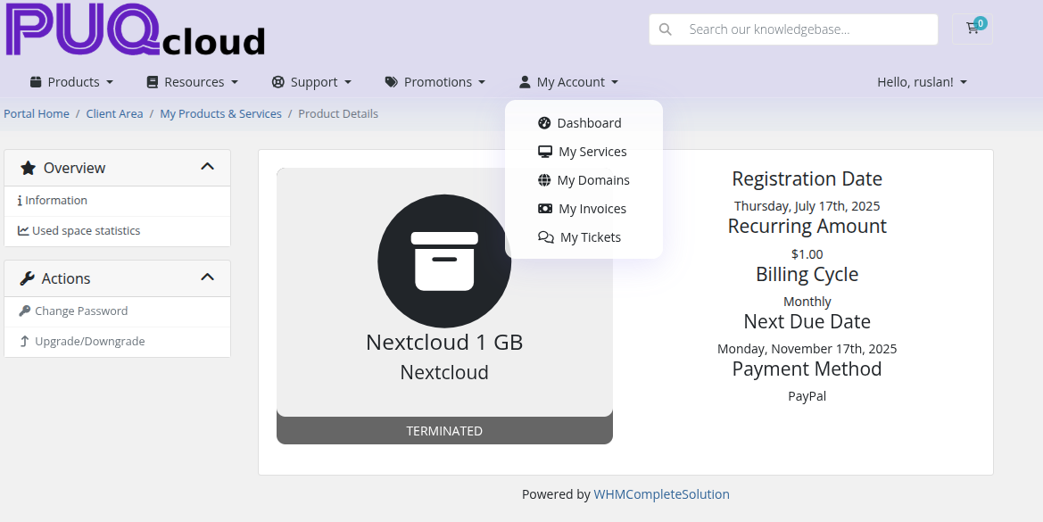 Glass Morphism — dropdown menu with transparent blur effect
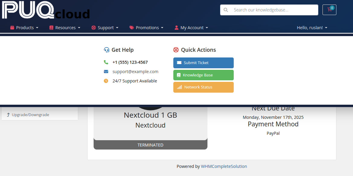
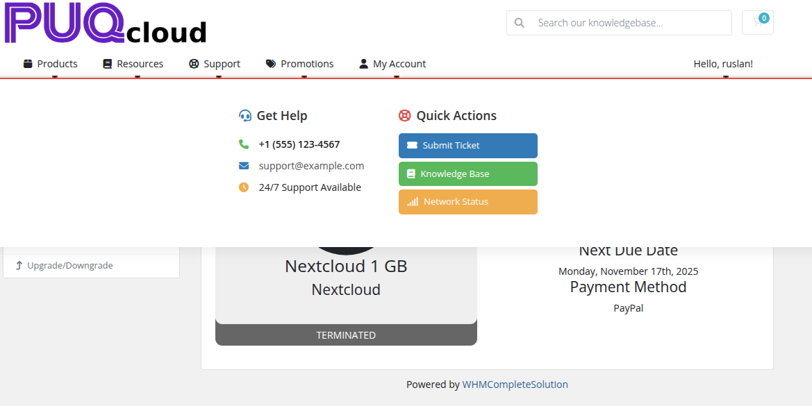
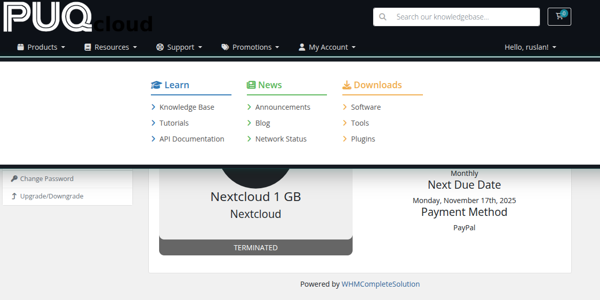
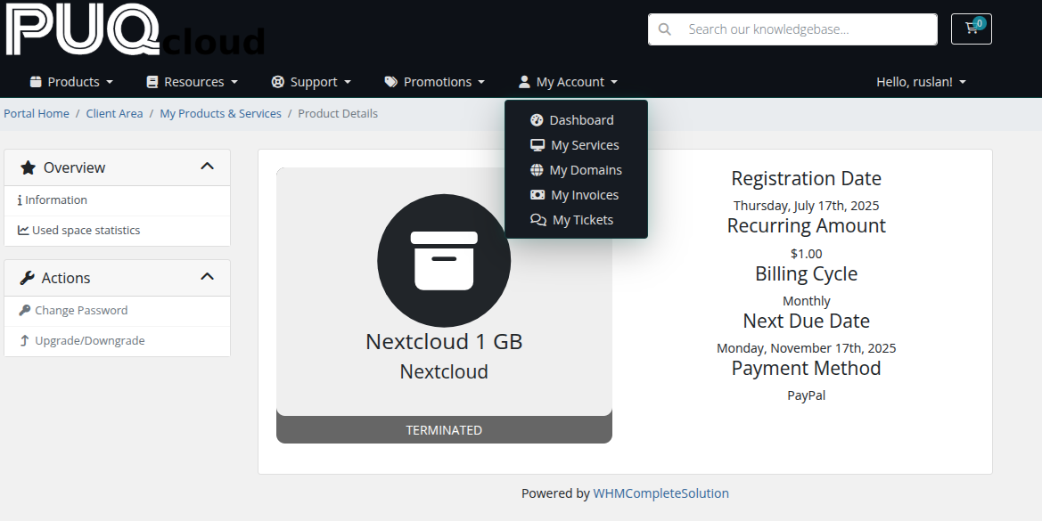
Modern Shadow
 Modern Shadow — clean design with subtle shadows and mega menu
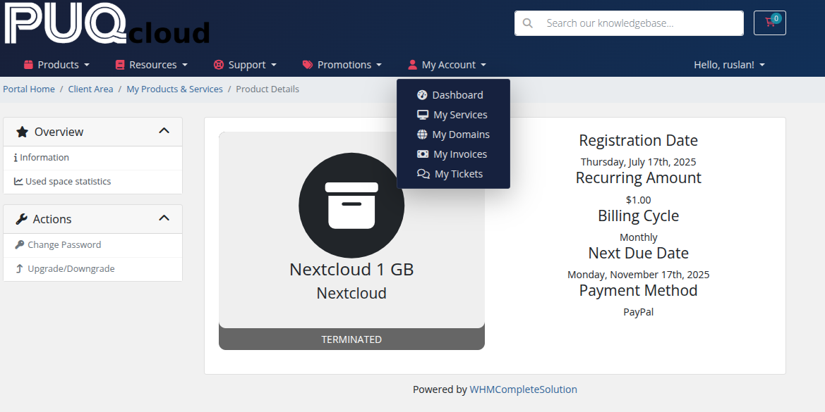
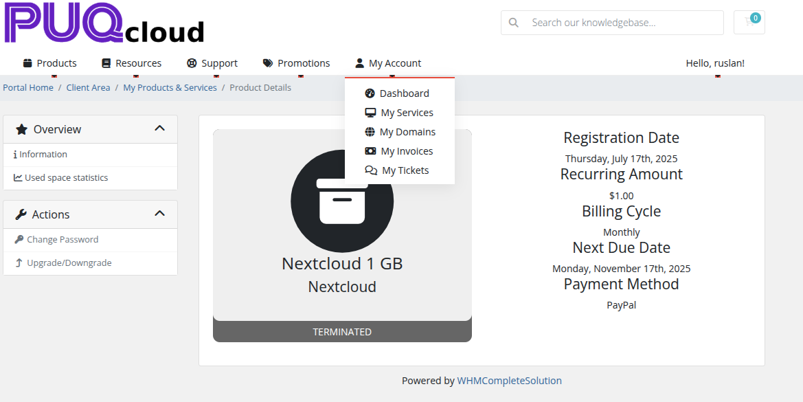
 Modern Shadow — dropdown menu with smooth hover transitions
Dark Elegant
 Dark Elegant — dark background navbar with mega menu
 Dark Elegant — dark navbar with dropdown menu and light text
Gradient Wave
 Gradient Wave — vibrant gradient backgrounds with mega menu
 Gradient Wave — colorful gradient effects with dropdown menu
Minimal Underline
 Minimal Underline — ultra-clean design with mega menu
 Minimal Underline — animated underline effect with dropdown menu
Neon Glow
 Neon Glow — dark background with luminous mega menu columns
 Neon Glow — neon accent colors with dropdown menu
Classic Bordered
 Classic Bordered — traditional bordered design with mega menu
 Classic Bordered — classic borders and separators with dropdown menu