Call To Action
Page Manager addon WHMCS
The Call To Action widget renders a prominent banner with a heading, subtitle, description, and up to two action buttons. It is designed to direct visitors toward a key conversion goal such as signing up, purchasing, or contacting support.
Admin Settings
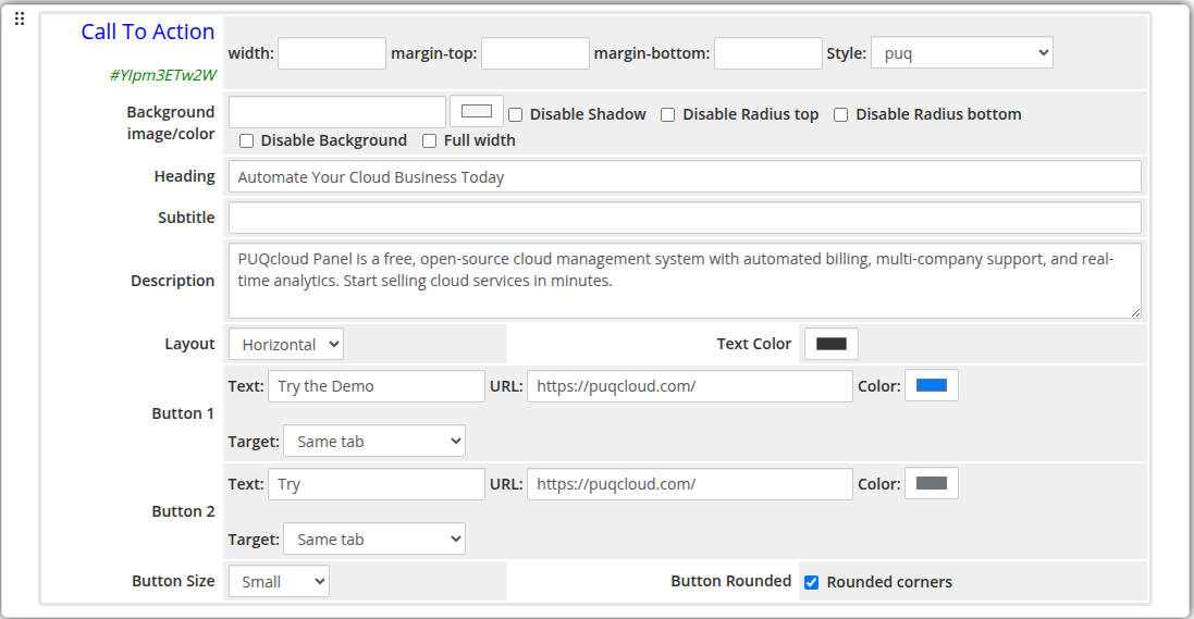 call-to-action-admin.png
Frontend
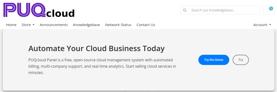 call-to-action-frontend.png
Settings
Content Settings
| Setting |
Type |
Default |
Description |
| heading |
text |
— |
Main heading text |
| subtitle |
text |
— |
Subtitle displayed below the heading |
| description |
textarea |
— |
Longer descriptive text below the subtitle |
| layout |
select |
center |
Content alignment: center, left, or horizontal |
| text_color |
color |
#333333 |
Color applied to all text content |
| Setting |
Type |
Default |
Description |
| button_text |
text |
— |
Label for the primary button |
| button_url |
text |
— |
URL the primary button links to |
| button_color |
color |
#337ab7 |
Background color of the primary button |
| button_target |
select |
_self |
Link target: Same tab or New tab |
| Setting |
Type |
Default |
Description |
| button2_text |
text |
— |
Label for the secondary button |
| button2_url |
text |
— |
URL the secondary button links to |
| button2_color |
color |
#6c757d |
Background color of the secondary button |
| button2_target |
select |
_self |
Link target: Same tab or New tab |
| Setting |
Type |
Default |
Description |
| button_size |
select |
md |
Size of both buttons: sm, md, or lg |
| button_rounded |
checkbox |
off |
Apply rounded corners to both buttons |
Layout Settings
| Setting |
Type |
Default |
Description |
| width |
text |
— |
CSS width of the widget container (e.g. 800px, 100%) |
| margin_top |
text |
— |
CSS top margin (e.g. 20px) |
| margin_bottom |
text |
— |
CSS bottom margin (e.g. 20px) |
| style |
select |
puq |
Visual style template |
| background_image |
text |
— |
URL of the background image |
| background_color |
color |
#FFFFFF |
Background color of the widget container |
| disable_background_shadow |
checkbox |
off |
Remove the drop shadow from the container |
| disable_background_radius_top |
checkbox |
off |
Remove the top border radius from the container |
| disable_background_radius_bottom |
checkbox |
off |
Remove the bottom border radius from the container |
| disable_background |
checkbox |
off |
Disable the background container entirely |
| full_width |
checkbox |
off |
Stretch the widget to the full page width |
Style Templates
| Template |
Description |
puq |
Default call-to-action style |
 Skip to main content