 Skip to main content
Timeline
Page Manager addon WHMCS
Order now | Download | FAQ
The Timeline widget renders a chronological sequence of events. Each entry has a date, an icon, a dot color, a title, and a description. The timeline supports vertical and horizontal layouts with an optional alternating sides mode.
Admin Settings
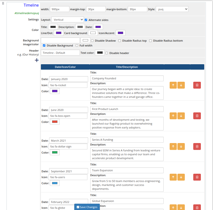 timeline-01-admin.png
Style Templates
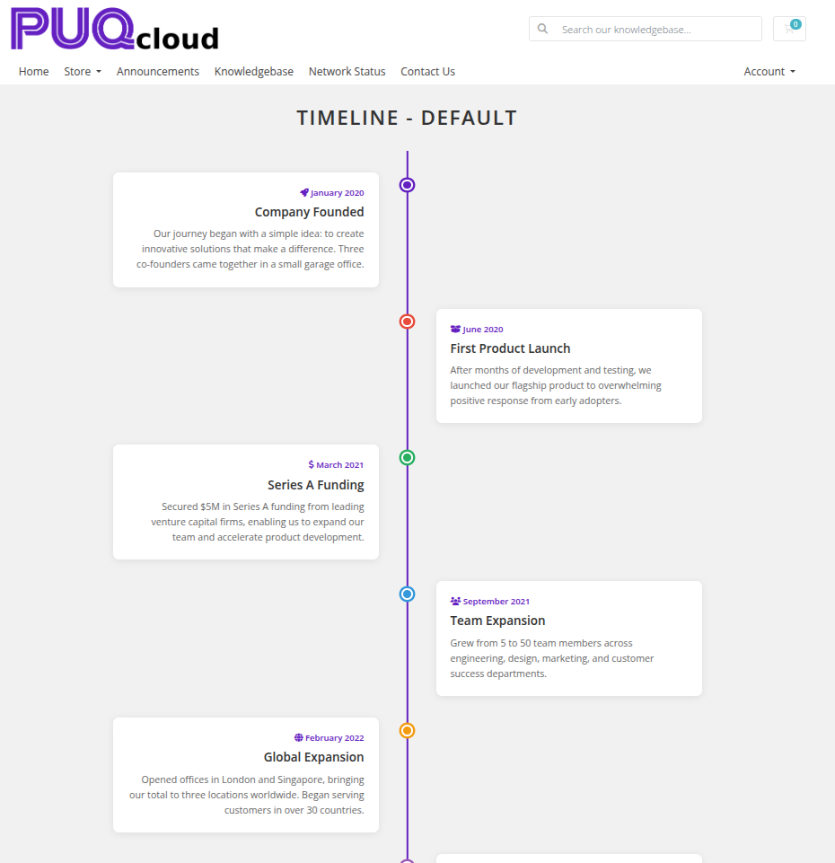 timeline-02-style-default.png
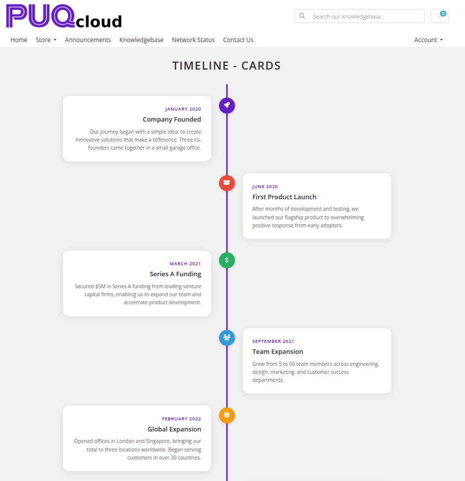 timeline-03-style-cards.png
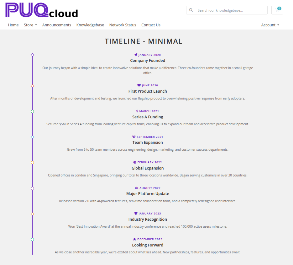 timeline-04-style-minimal.png
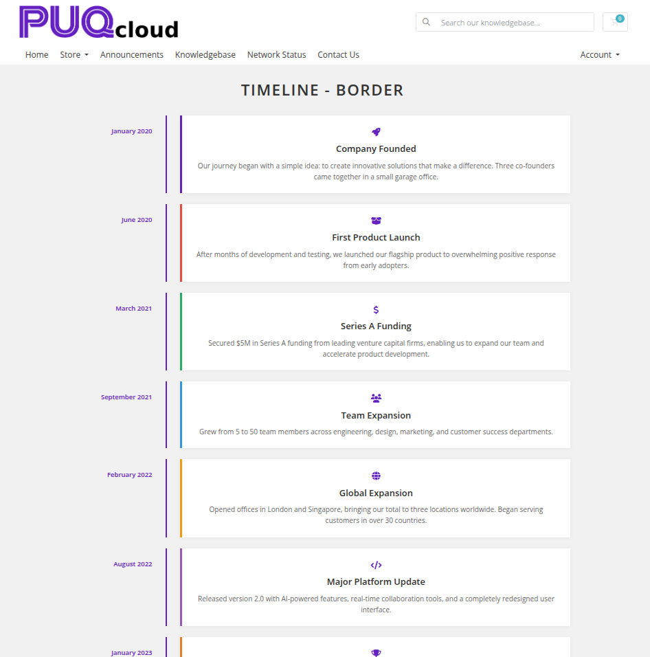 timeline-05-style-border.png
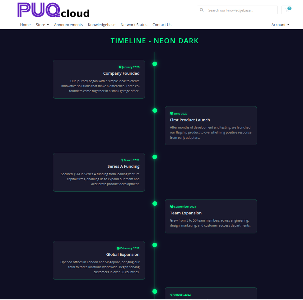
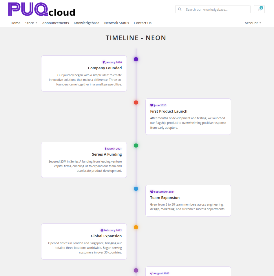 timeline-06-style-neon.png
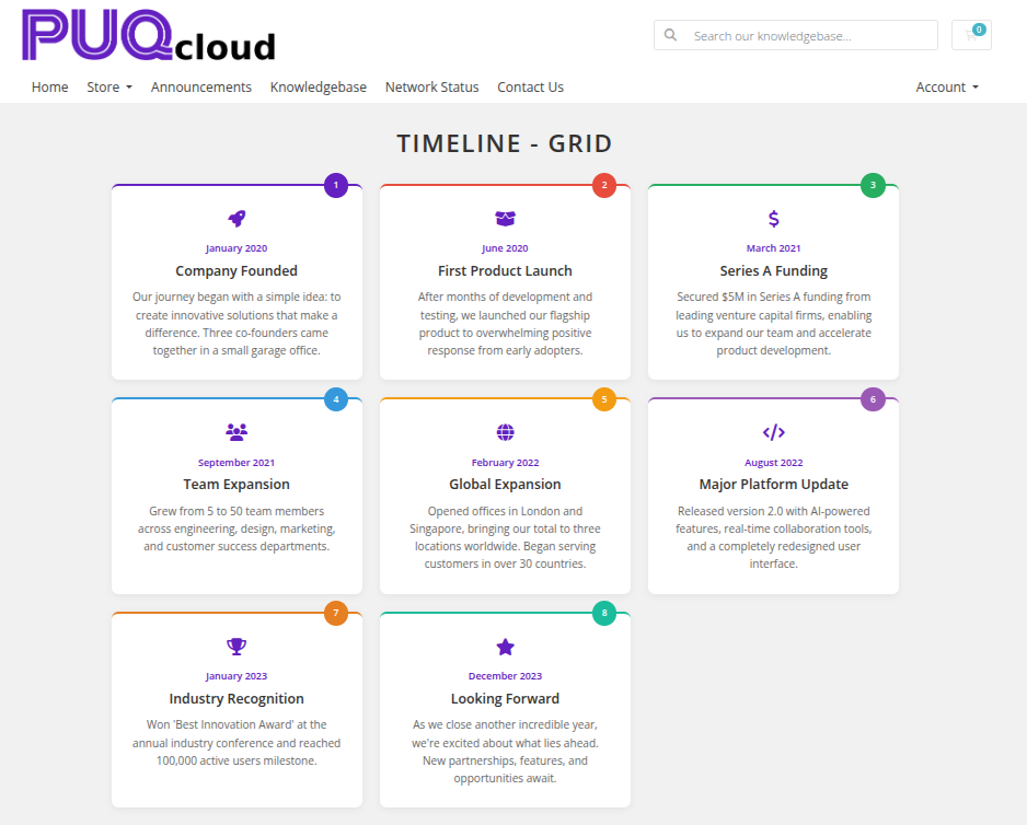 timeline-07-style-grid.png
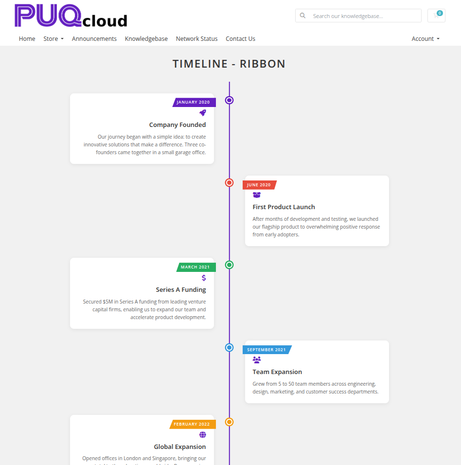 timeline-08-style-ribbon.png
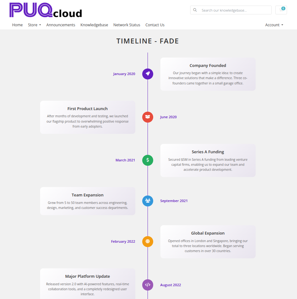 timeline-09-style-fade.png
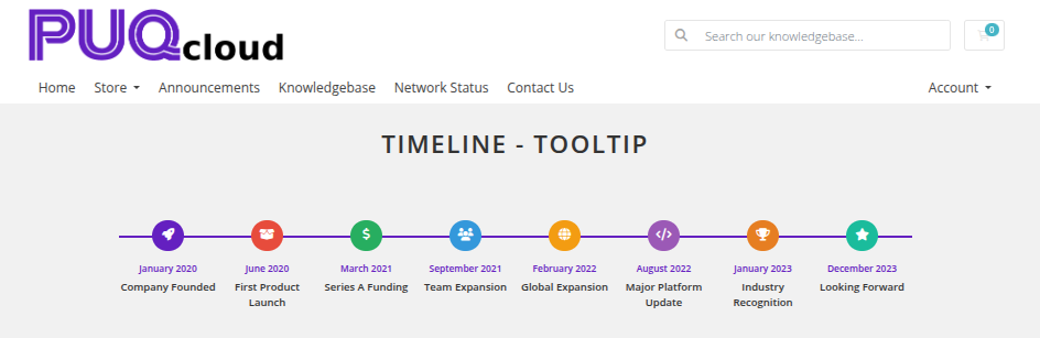 timeline-10-style-tooltip.png
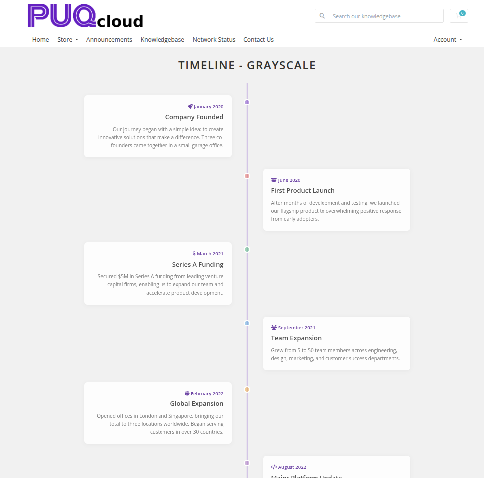 timeline-11-style-grayscale.png
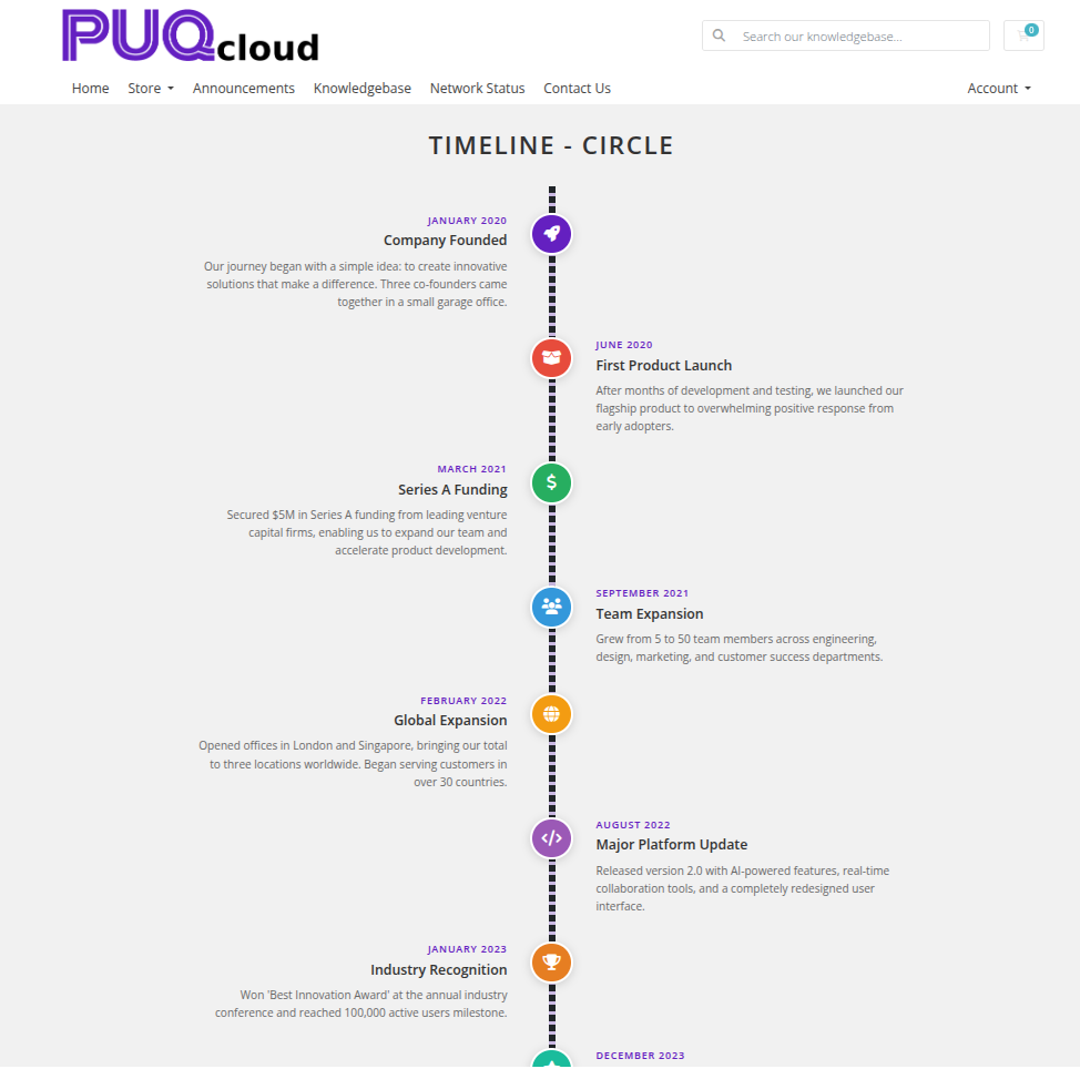 timeline-12-style-circle.png
 timeline-13-style-neon-alt.png
Settings
Content Settings
| Setting | Type | Default | Description |
|---|---|---|---|
| layout | select | vertical |
Timeline orientation: vertical or horizontal |
| alternate | checkbox | off | Alternate event cards between left and right sides of the timeline axis |
Color Settings
| Setting | Type | Default | Description |
|---|---|---|---|
| color_1 | color | — | Event title text color |
| color_2 | color | — | Event description text color |
| color_3 | color | — | Event date text color |
| color_4 | color | — | Timeline line and dot color |
| color_5 | color | — | Event card background color |
| color_6 | color | — | Icon and accent color |
Header
| Setting | Type | Default | Description |
|---|---|---|---|
| header | text | Our History |
Heading text displayed above the widget |
| header_text_color | color | #000000 |
Color of the header text |
| disable_header | checkbox | off | Hide the header entirely |
Items
Each timeline entry is a row in the visual editor with the following fields:
| Field | Description |
|---|---|
| date | Date or time label for the event (e.g. 2024, January 2025) |
| icon | Font Awesome icon class for the timeline dot (e.g. fas fa-star) |
| color | Dot color for this specific entry (overrides the global dot color) |
| title | Title of the event |
| description | Description text for the event (stored base64-encoded) |
Items can be added, removed, and reordered using the visual editor.
Layout Settings
| Setting | Type | Default | Description |
|---|---|---|---|
| width | text | — | CSS width of the widget container (e.g. 800px, 100%) |
| margin_top | text | — | CSS top margin (e.g. 20px) |
| margin_bottom | text | — | CSS bottom margin (e.g. 20px) |
| style | select | puq |
Visual style template |
| background_image | text | — | URL of the background image |
| background_color | color | #ffffff |
Background color of the widget container |
| disable_background_shadow | checkbox | off | Remove the drop shadow from the container |
| disable_background_radius_top | checkbox | off | Remove the top border radius from the container |
| disable_background_radius_bottom | checkbox | off | Remove the bottom border radius from the container |
| disable_background | checkbox | off | Disable the background container entirely |
| full_width | checkbox | off | Stretch the widget to the full page width |