Slider Logos
Page Manager addon WHMCS
The Slider Logos widget renders a horizontally scrolling logo carousel. Logos are automatically duplicated to create a seamless infinite loop. Each logo entry supports a name, image URL, and an optional link.
Admin Settings
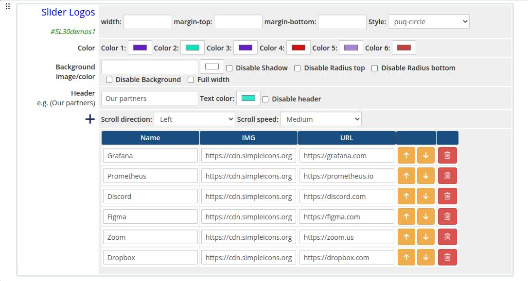 slider-logos-admin.png
Frontend
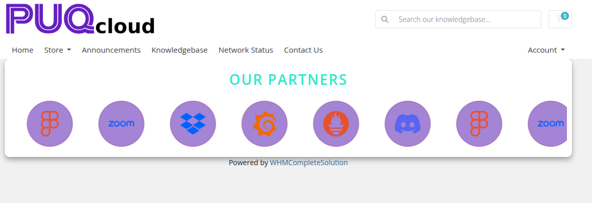 slider-logos-frontend.png
Settings
Color Settings
| Setting |
Type |
Default |
Description |
| color_1 |
color |
#6420c0 |
Primary accent color |
| color_2 |
color |
#0de1b9 |
Secondary accent color |
| color_3 |
color |
#6420c0 |
Tertiary accent color |
| color_4 |
color |
#d41111 |
Fourth accent color |
| color_5 |
color |
#a484d5 |
Fifth accent color |
| color_6 |
color |
#000000 |
Sixth accent color |
| Setting |
Type |
Default |
Description |
| header |
text |
Our partners |
Heading text displayed above the logo strip |
| header_text_color |
color |
#000000 |
Color of the header text |
| disable_header |
checkbox |
off |
Hide the header entirely |
| Setting |
Type |
Default |
Description |
| scroll |
select |
left |
Scroll direction: left or right |
| scroll_speed |
select |
20 |
Animation speed: 5 (Very fast), 10 (Fast), 20 (Medium), 30 (Slowly), 40 (So slow), 60 (Very Very Slow) |
Logos
Each logo entry is a row in the visual editor with the following fields:
| Field |
Description |
| logo_name |
Display name of the logo (used as alt text and tooltip) |
| logo_img |
URL of the logo image |
| logo_url |
Optional link URL when the logo is clicked |
Logos can be added, removed, and reordered using the visual editor.
Layout Settings
| Setting |
Type |
Default |
Description |
| width |
text |
— |
CSS width of the widget container (e.g. 800px, 100%) |
| margin_top |
text |
— |
CSS top margin (e.g. 20px) |
| margin_bottom |
text |
— |
CSS bottom margin (e.g. 20px) |
| style |
select |
puq |
Visual style template |
| background_image |
text |
— |
URL of the background image |
| background_color |
color |
#ffffff |
Background color of the widget container |
| disable_background_shadow |
checkbox |
off |
Remove the drop shadow from the container |
| disable_background_radius_top |
checkbox |
off |
Remove the top border radius from the container |
| disable_background_radius_bottom |
checkbox |
off |
Remove the bottom border radius from the container |
| disable_background |
checkbox |
off |
Disable the background container entirely |
| full_width |
checkbox |
off |
Stretch the widget to the full page width |
Style Templates
| Template |
Description |
puq |
Default logo strip style |
puq-border |
Logos displayed with a border frame |
puq-cards |
Logos rendered inside card containers |
puq-circle |
Logos cropped and displayed in circular frames |
puq-fade |
Fade transition effect on logo edges |
puq-grayscale |
Logos displayed in grayscale, colorized on hover |
puq-grid |
Logos arranged in a grid layout |
puq-neon |
Neon glow effect on logos |
puq-ribbon |
Logos displayed with a ribbon overlay |
puq-tooltip |
Logos show a tooltip with the logo name on hover |
 Skip to main content