Hero Section
Page Manager addon WHMCS
The Hero Section widget renders a full-width banner intended for the top of a page. It supports a badge tag, title, subtitle, description, two action buttons, overlay effects, a background video, and parallax scrolling. All typography, layout, and background options are configurable.
Admin Settings
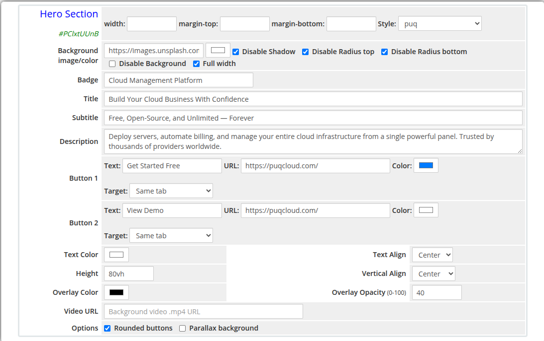 hero-section-admin.png
Frontend
hero-section-frontend.png
Settings
Content Settings
| Setting |
Type |
Default |
Description |
| badge |
text |
— |
Small tag displayed above the title (e.g. New Release, Special Offer) |
| title |
text |
— |
Main hero heading |
| subtitle |
text |
— |
Secondary line of text below the title |
| description |
textarea |
— |
Longer descriptive paragraph below the subtitle |
| Setting |
Type |
Default |
Description |
| button_text |
text |
— |
Label for the primary button |
| button_url |
text |
— |
URL the primary button links to |
| button_color |
color |
#337ab7 |
Background color of the primary button |
| button_target |
select |
_self |
Link target: Same tab or New tab |
| Setting |
Type |
Default |
Description |
| button2_text |
text |
— |
Label for the secondary button |
| button2_url |
text |
— |
URL the secondary button links to |
| button2_color |
color |
#ffffff |
Background color of the secondary button |
| button2_target |
select |
_self |
Link target: Same tab or New tab |
Typography and Alignment
| Setting |
Type |
Default |
Description |
| text_color |
color |
#ffffff |
Color applied to all text content in the hero |
| text_align |
select |
center |
Horizontal alignment of content: center, left, or right |
| vertical_align |
select |
center |
Vertical alignment of content: center, top, or bottom |
Dimensions and Overlay
| Setting |
Type |
Default |
Description |
| height |
text |
80vh |
CSS height of the hero section (e.g. 80vh, 600px) |
| overlay_color |
color |
#000000 |
Color of the semi-transparent overlay on top of the background |
| overlay_opacity |
number |
40 |
Opacity of the overlay (0 = fully transparent, 100 = fully opaque) |
| video_url |
text |
— |
URL of a .mp4 video file to use as the background |
| Setting |
Type |
Default |
Description |
| button_rounded |
checkbox |
on |
Apply rounded corners to both buttons |
| parallax |
checkbox |
off |
Enable parallax scrolling effect on the background image |
Layout Settings
| Setting |
Type |
Default |
Description |
| width |
text |
— |
CSS width of the widget container (e.g. 800px, 100%) |
| margin_top |
text |
— |
CSS top margin (e.g. 20px) |
| margin_bottom |
text |
— |
CSS bottom margin (e.g. 20px) |
| style |
select |
puq |
Visual style template |
| background_image |
text |
— |
URL of the hero background image |
| background_color |
color |
#1a1a2e |
Fallback background color when no image is set |
| disable_background_shadow |
checkbox |
off |
Remove the drop shadow from the container |
| disable_background_radius_top |
checkbox |
off |
Remove the top border radius from the container |
| disable_background_radius_bottom |
checkbox |
off |
Remove the bottom border radius from the container |
| disable_background |
checkbox |
off |
Disable the background container entirely |
| full_width |
checkbox |
off |
Stretch the widget to the full page width |
Style Templates
| Template |
Description |
puq |
Default hero section style |
 Skip to main content