 Skip to main content
Product Cards
Page Manager addon WHMCS
Order now | Download | FAQ
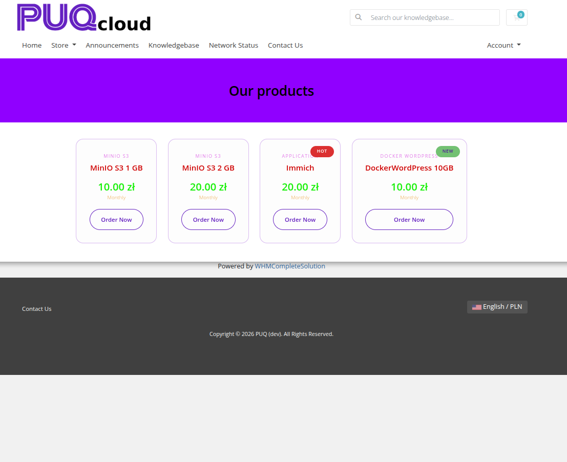
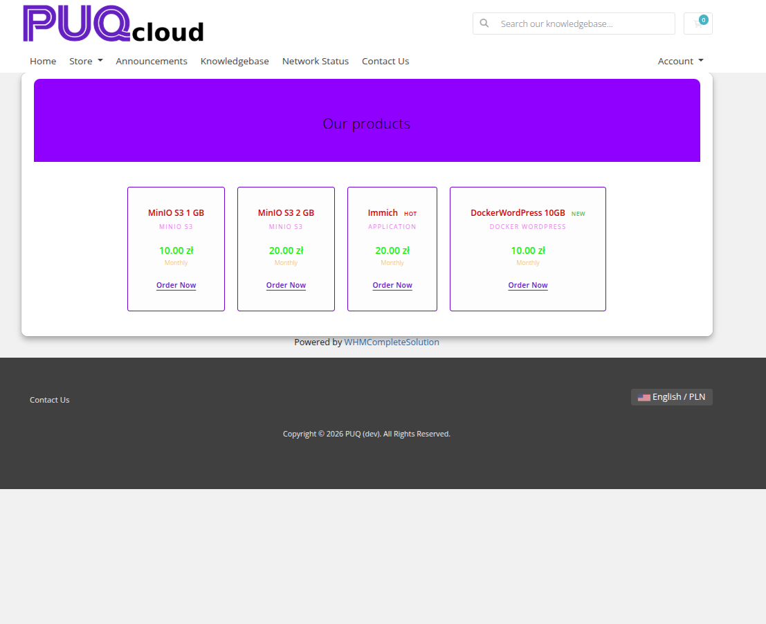
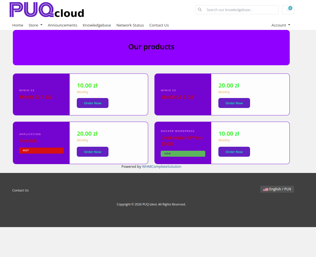
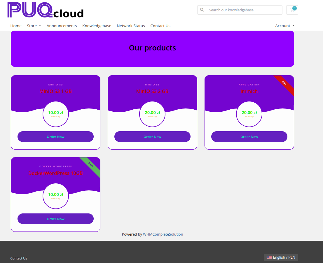
The Product Cards widget displays WHMCS products with their pricing and descriptions in a card layout. Products can be loaded automatically from a WHMCS product group or added manually. Each card supports hot/new/sale badge overlays and an Order Now button. Ten visual styles are available.
Admin View
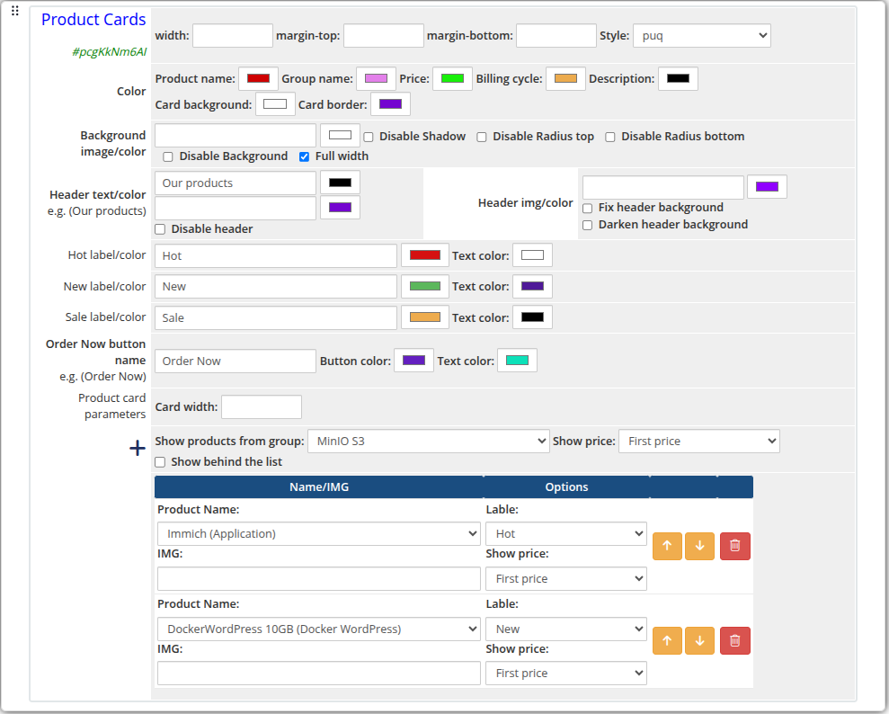 product-cards-01-admin.png
Frontend Styles
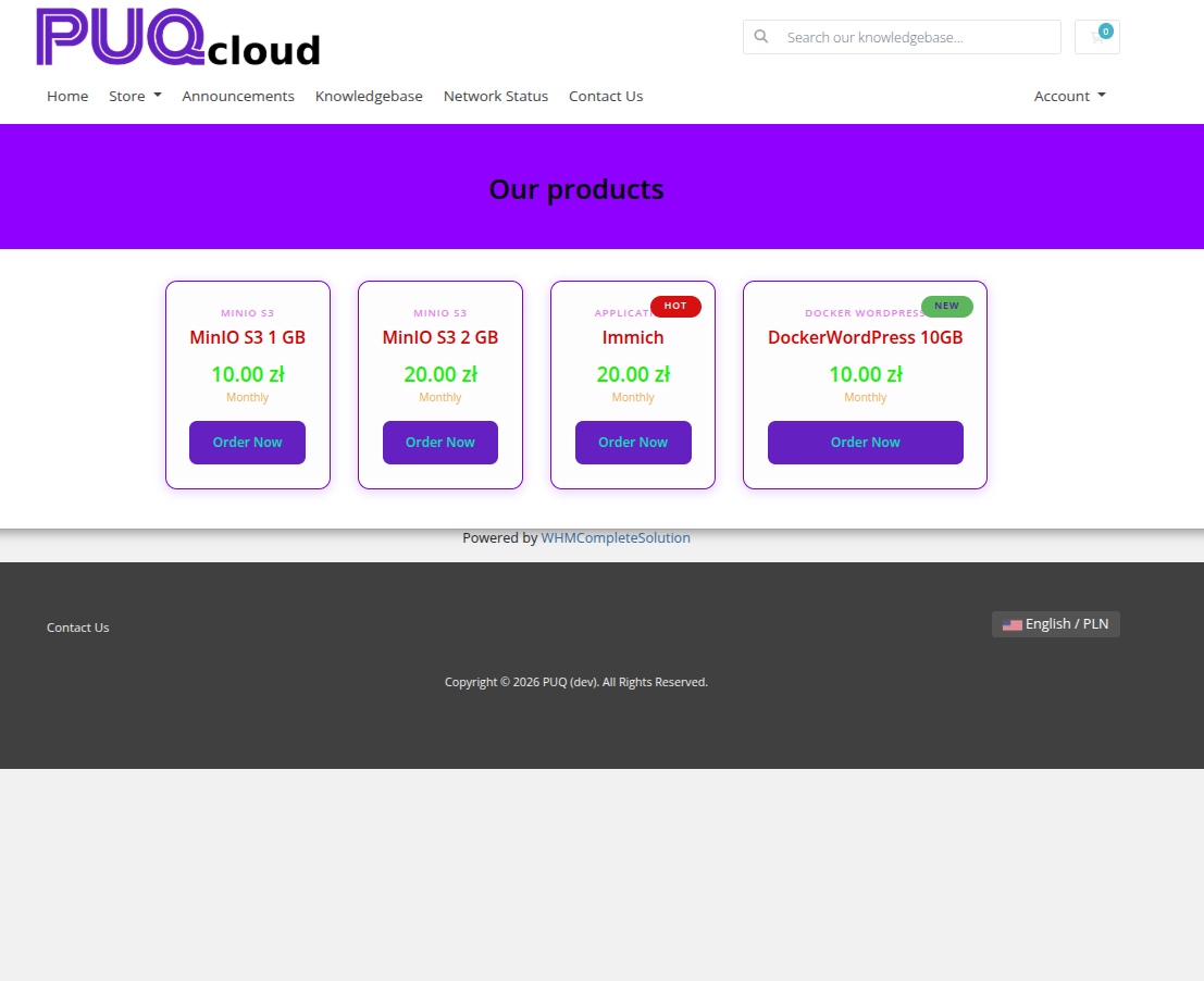 product-cards-02-style-default.png
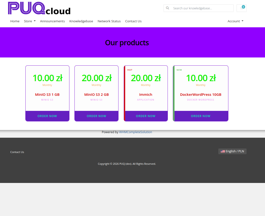 product-cards-03-style-bold.png
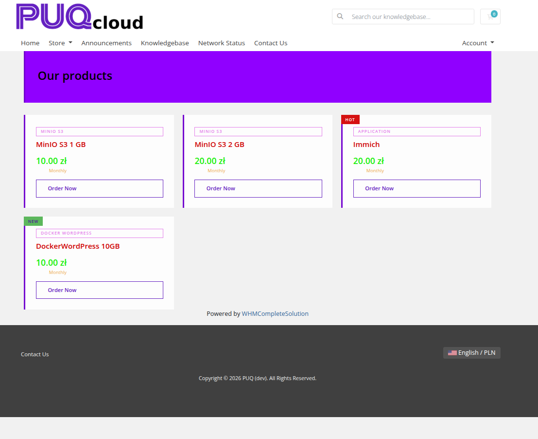 product-cards-04-style-border.png
 product-cards-05-style-glass.png
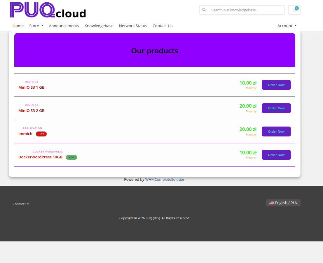 product-cards-06-style-list.png
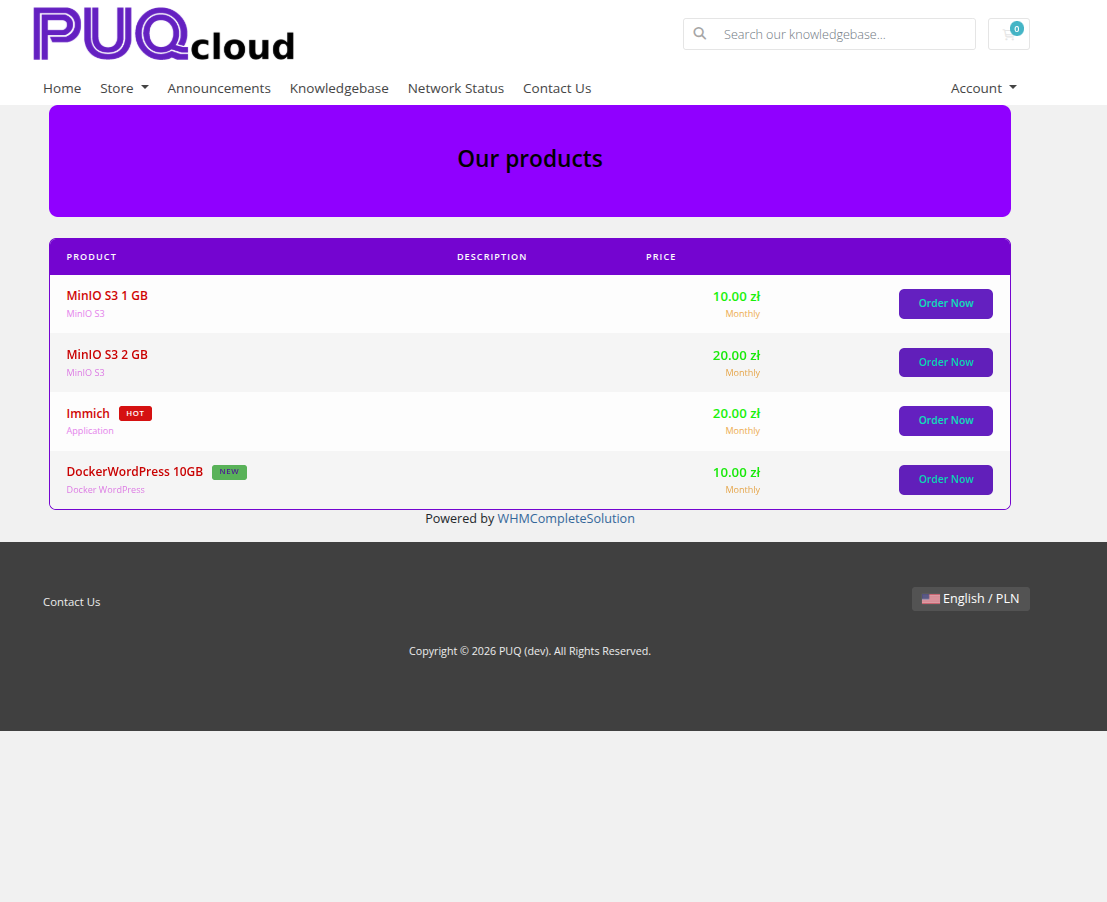 product-cards-07-style-line.png
 product-cards-08-style-tile.png
 product-cards-09-style-split.png
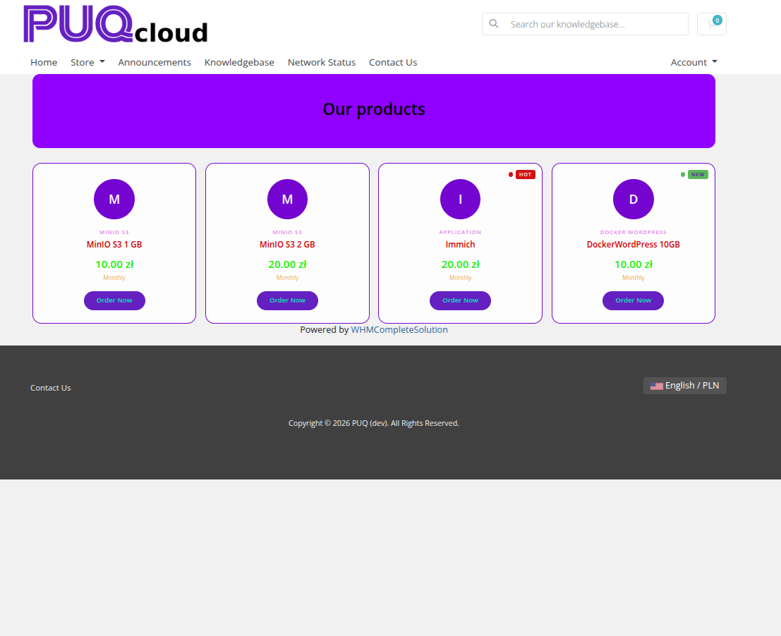 product-cards-10-style-minimal.png
 product-cards-11-style-wave.png
 product-cards-12-style-wave-alt.png
Settings
Layout
| Setting | Description |
|---|---|
| width | Widget container width (e.g. 100%, 1200px) |
| margin-top | Top margin of the widget block |
| margin-bottom | Bottom margin of the widget block |
| Style | Visual style template (puq, puq-bold, puq-border, puq-glass, puq-line, puq-list, puq-minimal, puq-split, puq-tile, puq-wave) |
| Card width | Fixed width for each product card (e.g. 300px) |
Colors
| Setting | Description |
|---|---|
Product name (color_1) |
Color of the product name text |
Group name (color_2) |
Color of the product group name text |
Price (color_3) |
Color of the price value |
Billing cycle (color_4) |
Color of the billing cycle label |
Description (color_5) |
Color of the product description text |
Card background (color_6) |
Background color of each product card |
Card border (color_7) |
Border color of each product card |
Background
| Setting | Description |
|---|---|
| Background image | URL of the background image for the widget container |
| Background color | Background color of the widget container |
| Disable Shadow | Remove the drop shadow from the widget container |
| Disable Radius top | Remove top corner rounding |
| Disable Radius bottom | Remove bottom corner rounding |
| Disable Background | Remove the background panel entirely |
| Full width | Stretch the widget to the full page width |
Header
| Setting | Description |
|---|---|
| Header text | Main heading text above the product cards (e.g. Our products) |
| Header text color | Color of the heading text |
| Header description | Subheading or description text below the main heading |
| Header description color | Color of the description text |
| Disable header | Hide the header section |
| Header background image | URL of a background image for the header area |
| Header background color | Background color of the header area |
| Fix header background | Fix the header background image during scroll (parallax) |
| Darken header background | Apply a darkening overlay on the header background |
Badges
| Setting | Description |
|---|---|
| Hot label | Text for the "Hot" badge (e.g. Hot) |
| Hot color | Background color of the Hot badge |
| Hot text color | Text color of the Hot badge |
| New label | Text for the "New" badge (e.g. New) |
| New color | Background color of the New badge |
| New text color | Text color of the New badge |
| Sale label | Text for the "Sale" badge (e.g. Sale) |
| Sale color | Background color of the Sale badge |
| Sale text color | Text color of the Sale badge |
Order Now Button
| Setting | Description |
|---|---|
| Order Now button name | Label for the order button (e.g. Order Now) |
| Button color | Background color of the order button |
| Text color | Text color of the order button |
Product Source
| Setting | Description |
|---|---|
| Show products from group | Automatically load all products from a WHMCS product group |
| Show price | Which price to display: First price, Best price, Monthly price, Semi annual price, Annual price, Biennially price, or Triennially price |
| Show behind the list | Append the auto-loaded group products after the manually listed products |