 Skip to main content
Contact Form
Page Manager addon WHMCS
Order now | Download | FAQ
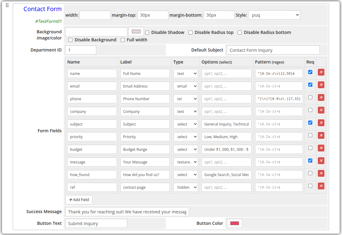
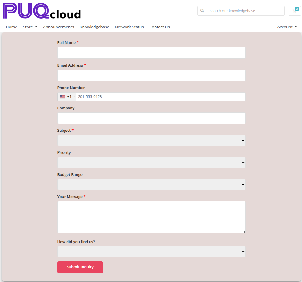
The Contact Form widget renders a fully customizable form that submits visitor messages directly to a WHMCS support department. Form fields are configurable with a visual editor supporting multiple input types, validation patterns, and required flags.
Admin Settings
 contact-form-admin.png
Frontend
 contact-form-frontend.png
Settings
Form Settings
| Setting | Type | Default | Description |
|---|---|---|---|
| department_id | text | — | WHMCS support department ID to receive submitted tickets |
| subject_default | text | — | Pre-filled subject line for the generated support ticket |
| success_message | text | Thank you! Your message has been sent. |
Message shown to the visitor after a successful submission |
| button_text | text | Send Message |
Label on the submit button |
| button_color | color | #6420c0 |
Background color of the submit button |
Form Fields
Fields are defined with a visual row editor. Each row has the following columns:
| Column | Description |
|---|---|
| Name | Internal field name (used as the form input name attribute) |
| Label | Human-readable label shown above the field |
| Type | Input type: text, email, textarea, select, tel, number, or hidden |
| Options | Comma-separated list of options for select type fields |
| Pattern | Optional regex validation pattern (e.g. ^[A-Za-z]+$) |
| Required | Checkbox — marks the field as mandatory |
Default fields: name (text, required), email (email, required), message (textarea, required).
Fields can be added, removed, and reordered using the visual editor.
Layout Settings
| Setting | Type | Default | Description |
|---|---|---|---|
| width | text | — | CSS width of the widget container (e.g. 800px, 100%) |
| margin_top | text | — | CSS top margin (e.g. 20px) |
| margin_bottom | text | — | CSS bottom margin (e.g. 20px) |
| style | select | puq |
Visual style template |
| background_image | text | — | URL of the background image |
| background_color | color | #FFFFFF |
Background color of the widget container |
| disable_background_shadow | checkbox | off | Remove the drop shadow from the container |
| disable_background_radius_top | checkbox | off | Remove the top border radius from the container |
| disable_background_radius_bottom | checkbox | off | Remove the bottom border radius from the container |
| disable_background | checkbox | off | Disable the background container entirely |
| full_width | checkbox | off | Stretch the widget to the full page width |
Style Templates
| Template | Description |
|---|---|
puq |
Default contact form style |