 Skip to main content
Promo Slider
Page Manager addon WHMCS
Order now | Download | FAQ
The Promo Slider widget renders an image carousel with text overlays and call-to-action buttons. Each slide can have a heading, description, foreground image, background image, and a button link. Ten visual styles are available, including cinematic, parallax, and split-screen layouts.
Admin View
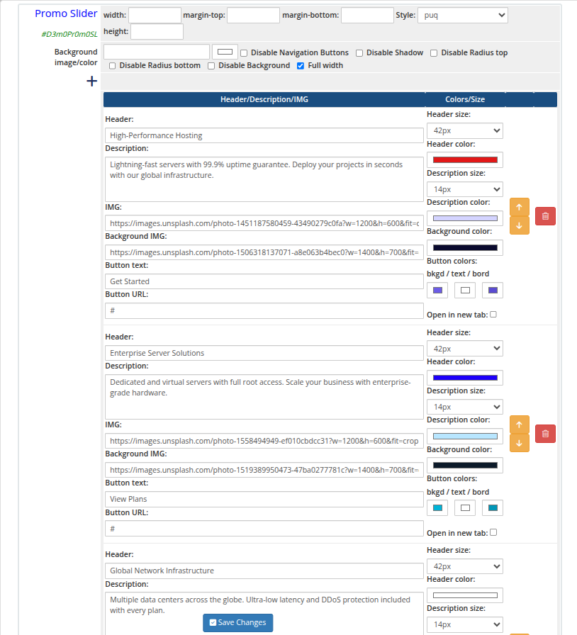 promo-slider-01-admin.png
Frontend Styles
 promo-slider-02-style-default.png
 promo-slider-03-style-cards.png
promo-slider-04-style-cinema.png
promo-slider-05-style-glass.png
promo-slider-06-style-hero.png
promo-slider-07-style-kenburns.png
promo-slider-08-style-magazine.png
promo-slider-09-style-minimal.png
promo-slider-10-style-neon.png
promo-slider-11-style-split.png
promo-slider-12-style-split-alt.png
Settings
Layout
| Setting | Description |
|---|---|
| width | Widget container width (e.g. 100%, 1200px) |
| margin-top | Top margin of the widget block |
| margin-bottom | Bottom margin of the widget block |
| Style | Visual style template (puq, puq-cards, puq-cinema, puq-glass, puq-hero, puq-kenburns, puq-magazine, puq-minimal, puq-neon, puq-split) |
| height | Slider height (e.g. 500px) |
Background & Options
| Setting | Description |
|---|---|
| Background image | URL of the background image for the widget container |
| Background color | Background color of the widget container |
| Disable Navigation Buttons | Hide the previous/next arrow buttons on the slider |
| Disable Shadow | Remove the drop shadow from the widget container |
| Disable Radius top | Remove top corner rounding |
| Disable Radius bottom | Remove bottom corner rounding |
| Disable Background | Remove the background panel entirely |
| Full width | Stretch the widget to the full page width |
Slides
| Field | Description |
|---|---|
| Header | Heading text for the slide |
| Header size | Font size selector for the heading |
| Header color | Color of the heading text |
| Description | Body text or subtitle for the slide |
| Description size | Font size selector for the description |
| Description color | Color of the description text |
| IMG | URL of the foreground image displayed on the slide |
| Background IMG | URL of the background image for the slide |
| Button text | Label for the call-to-action button |
| Button URL | Destination URL for the call-to-action button |
Slides can be reordered with the up/down arrows and removed with the delete button.