Feature Grid
Page Manager addon WHMCS
The Feature Grid widget renders a responsive grid of feature cards. Each card displays a Font Awesome icon, a title, a description, and an optional link. The grid layout, icon appearance, card alignment, and visual options are all configurable.
Admin Settings
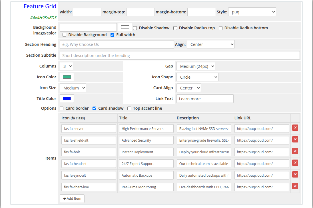 feature-grid-admin.png
Frontend
 feature-grid-frontend.png
Settings
| Setting |
Type |
Default |
Description |
| heading |
text |
— |
Section heading displayed above the grid (e.g. Why Choose Us) |
| heading_align |
select |
center |
Alignment of the heading: center, left, or right |
| subtitle |
text |
— |
Short description displayed beneath the heading |
Grid Layout
| Setting |
Type |
Default |
Description |
| columns |
select |
3 |
Number of columns: 2, 3, or 4 |
| gap |
select |
24 |
Spacing between cards: 16 (Small), 24 (Medium), or 32 (Large) pixels |
Icon Settings
| Setting |
Type |
Default |
Description |
| icon_color |
color |
#337ab7 |
Color applied to all feature icons |
| icon_shape |
select |
rounded |
Icon background shape: rounded (rounded square), circle, or none (no background) |
| icon_size |
select |
md |
Icon size: sm (Small), md (Medium), or lg (Large) |
Card Settings
| Setting |
Type |
Default |
Description |
| card_align |
select |
center |
Content alignment inside each card: center or left |
| title_color |
color |
#2c3e50 |
Color of the card title text |
| link_text |
text |
Learn more |
Label for the optional card link |
| show_border |
checkbox |
off |
Add a border around each card |
| show_shadow |
checkbox |
on |
Add a drop shadow to each card |
| show_accent |
checkbox |
off |
Add a colored accent line at the top of each card |
Feature Items
Items are managed with a visual row editor. Each row defines one feature card:
| Column |
Description |
| Icon |
Font Awesome class for the icon (e.g. fas fa-server, fas fa-shield-alt) |
| Title |
Feature card heading text |
| Description |
Short description text inside the card |
| Link URL |
Optional URL the card title or link text points to |
Items can be added and removed using the editor controls.
Layout Settings
| Setting |
Type |
Default |
Description |
| width |
text |
— |
CSS width of the widget container (e.g. 800px, 100%) |
| margin_top |
text |
— |
CSS top margin (e.g. 20px) |
| margin_bottom |
text |
— |
CSS bottom margin (e.g. 20px) |
| style |
select |
puq |
Visual style template |
| background_image |
text |
— |
URL of the background image |
| background_color |
color |
#FFFFFF |
Background color of the widget container |
| disable_background_shadow |
checkbox |
off |
Remove the drop shadow from the container |
| disable_background_radius_top |
checkbox |
off |
Remove the top border radius from the container |
| disable_background_radius_bottom |
checkbox |
off |
Remove the bottom border radius from the container |
| disable_background |
checkbox |
off |
Disable the background container entirely |
| full_width |
checkbox |
off |
Stretch the widget to the full page width |
Style Templates
| Template |
Description |
puq |
Default feature grid style |
 Skip to main content