 Skip to main content
Tabs / Accordion
Page Manager addon WHMCS
Order now | Download | FAQ
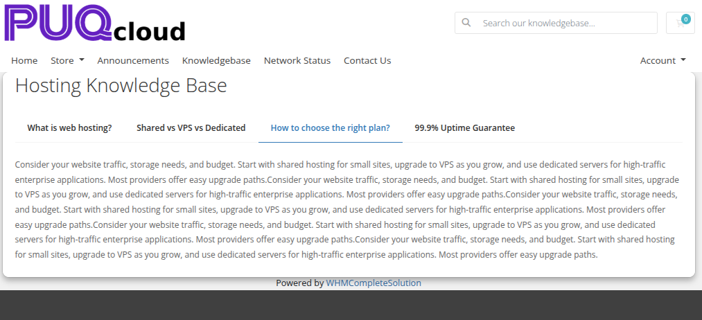
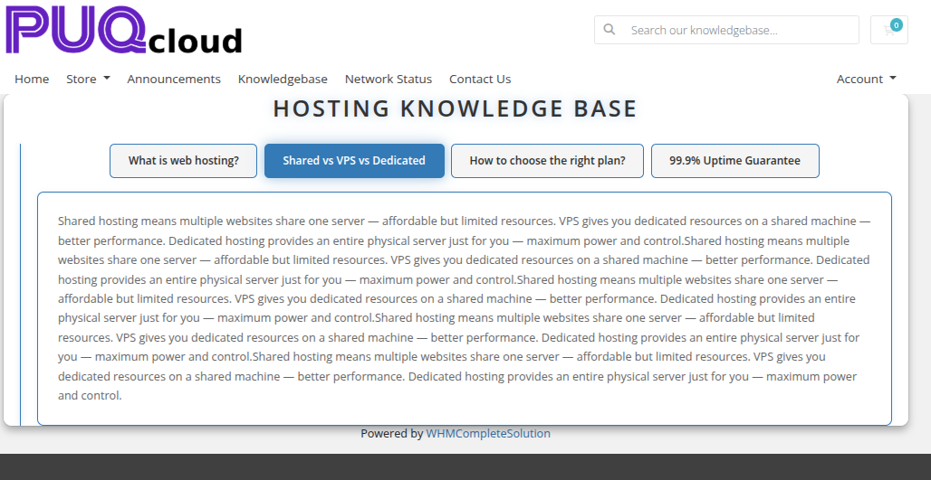
The Tabs / Accordion widget renders content sections that are toggled by clicking a tab or accordion header. It supports two modes — tabbed navigation and collapsible accordion — with rich HTML content in each section body.
Admin Settings
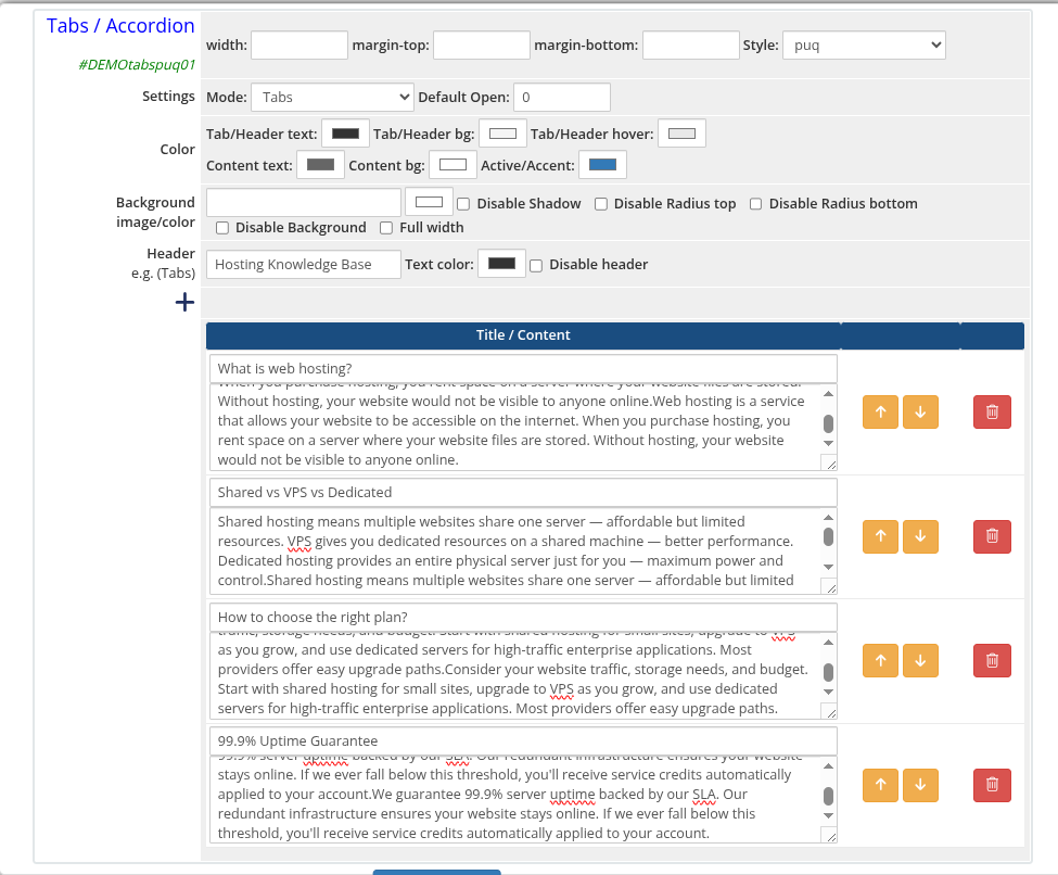 tabs-accordion-01-admin.png
Style Templates
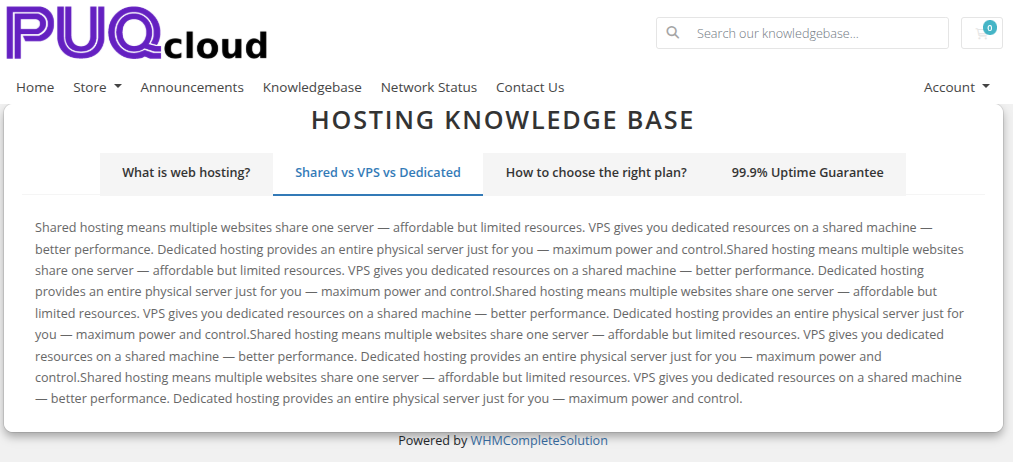 tabs-accordion-02-style-default.png
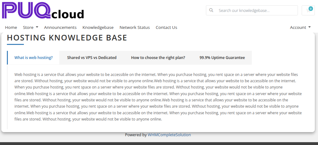 tabs-accordion-03-style-border.png
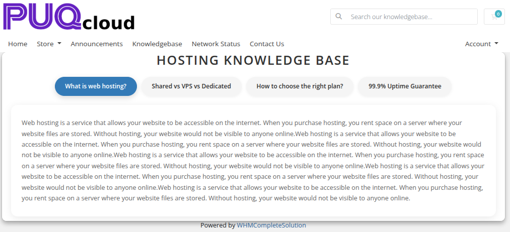 tabs-accordion-04-style-cards.png
 tabs-accordion-05-style-minimal.png
 tabs-accordion-06-style-neon.png
Settings
Content Settings
| Setting | Type | Default | Description |
|---|---|---|---|
| mode | select | accordion |
Display mode: tabs (horizontal tab bar) or accordion (collapsible sections) |
| default_open | number | 0 |
Zero-based index of the tab or section to open by default |
Color Settings
| Setting | Type | Default | Description |
|---|---|---|---|
| color_1 | color | #333333 |
Tab or accordion header text color |
| color_2 | color | #f5f5f5 |
Tab or accordion header background color |
| color_3 | color | #e8e8e8 |
Tab or accordion header hover color |
| color_4 | color | #666666 |
Content panel text color |
| color_5 | color | #ffffff |
Content panel background color |
| color_6 | color | #337ab7 |
Active tab or accordion accent color |
Header
| Setting | Type | Default | Description |
|---|---|---|---|
| header | text | Tabs |
Heading text displayed above the widget |
| header_text_color | color | #333333 |
Color of the header text |
| disable_header | checkbox | off | Hide the header entirely |
Items
Each item is a row in the visual editor with the following fields:
| Field | Description |
|---|---|
| title | Label shown on the tab button or accordion header |
| content | Rich HTML content displayed in the panel body (stored base64-encoded) |
Items can be added, removed, and reordered using the visual editor.
Layout Settings
| Setting | Type | Default | Description |
|---|---|---|---|
| width | text | — | CSS width of the widget container (e.g. 800px, 100%) |
| margin_top | text | — | CSS top margin (e.g. 20px) |
| margin_bottom | text | — | CSS bottom margin (e.g. 20px) |
| style | select | puq |
Visual style template |
| background_image | text | — | URL of the background image |
| background_color | color | #ffffff |
Background color of the widget container |
| disable_background_shadow | checkbox | off | Remove the drop shadow from the container |
| disable_background_radius_top | checkbox | off | Remove the top border radius from the container |
| disable_background_radius_bottom | checkbox | off | Remove the bottom border radius from the container |
| disable_background | checkbox | off | Disable the background container entirely |
| full_width | checkbox | off | Stretch the widget to the full page width |